
i like astro
i don’t like meta blog posts
as in, posts on a website about the technical choices of the site itself
i’ve seen some blogs that end up just containing meta posts, with no actual follow up of real
content, before the author moves onto yet another choice of web framework / tool to power their site,
and therefore nukes the previous posts since they no longer talk about $CURRENT_HYPE_FRAMEWORK
but,
astro, is cool
i’ve used it for a lot of sites, and would like to chronicle where i’ve used it before, since often when the topic of astro comes up, all i can really do is mention:
i’ve used astro to build site-a.com / site-b.dev / tilde-site.sh/~site / …
so if the reason you’ve ended up on this page, is that i’ve started to talk about astro / brought it up somewhere on the internet and linked this article, hello! 👋
its funny writing this post, since this .mdx file i have open in my editor will potentially outlive the
current technical choice i’m making to use astro for this site, but i’ve used it too extensively at
this point across many websites not to talk about it
i’m sure future me will denote something at the top of this post pointing out if i’ve moved on from astro to something different in the future
but i’m writing in the now, so no more about future me
before i get into astro, i’d like to quickly discuss what i’ve used before
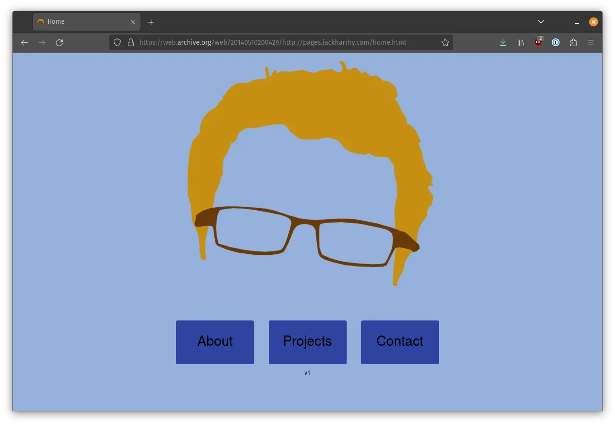
my main website, jackharrhy.com, was originally created as a plain html/css site back in 2014, hosted on a cpanel instance on lotosus
i had no idea for the longest time why i chose lotosus over basically any other provider, but after doing research online for this article, i ran across this reddit post from 2015 mentioning they accepted dogecoin as payment, at a time i was quite into dogecoin, so that was probably why i picked them
digging deeper into the wayback machine / my personal sites repository to document the major revisions over the years is something i’d like to do in detail someday, but the abridged summary, is that after moving on from original version, i think i had iterations that were:
- a webpack site (not making very much use of webpack features)
- using parcel at one point?
- probably back to a plain html/css/js site at times
- one had a backend serving blog posts from a database, which as most blogs that aren’t static and hand
rolled, are lost to time in
.git - a version written in crystal that did some trickery with docker to show the containers running on my VPS the site was hosted on, while that one had a backend which i usually avoid for a personal site, it was cool
the current version of jackharrhy.com, was however, not my first astro endeavour…
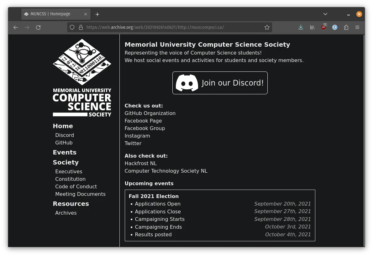
muncompsci.ca
the website for my computer science student society at my university, MUN, was by the time that i was involved with the executive around 2017, a lektor website
lektor was nice, it was very pythonic, it got the job done as far as letting you author sites with minimal markdown files / some jinja templating sprinkled in, but once we tried to push things with it a bit further, like adding a blog system, we were writing a lot of custom code to achieve what we wanted
i knew around 2020 i wanted to do a rewrite, and the hot choice at the time was to use gatsby
i don’t like disliking frameworks, but i tried to and failed to ‘jive’ with gatsby, it felt like i was required to bend myself backwards to get even the most basic of structure setup, with oodles of plugins to setup after installing gatsby to get basic things like mdx working, or needing to write chunks of graphql here and there before i could start seeing text on the screen that wasn’t just slapped directly into components
i see why gatsby was popular, especially if you were working a lot with external cms systems that could expose themselves as graphql, but if you were like myself and just intending to serve static files in the same repo alongside the layout files, quite a lot of boilerplate was required regardless
i don’t know if it has gotten better, i hope it has, but i abandoned my attempt at making muncompsci.ca a gatsby site once i realized how much work was required to even get a basic site created, and i didn’t feel it was the most maintainable thing for future contributors to the website
time passed after the gatsby attempt, and since i’m usually on the prowl on the orange site / watching fireship videos / overall consuming a lot of webdev-leaning technical content, astro popped up on my radar
the simplicity of astro from the early examples i saw made it intriguing to me, while still seeing that it gave you expanded functionality when you wanted it without the same level of complexity or manual effort required than lektor and gatsby
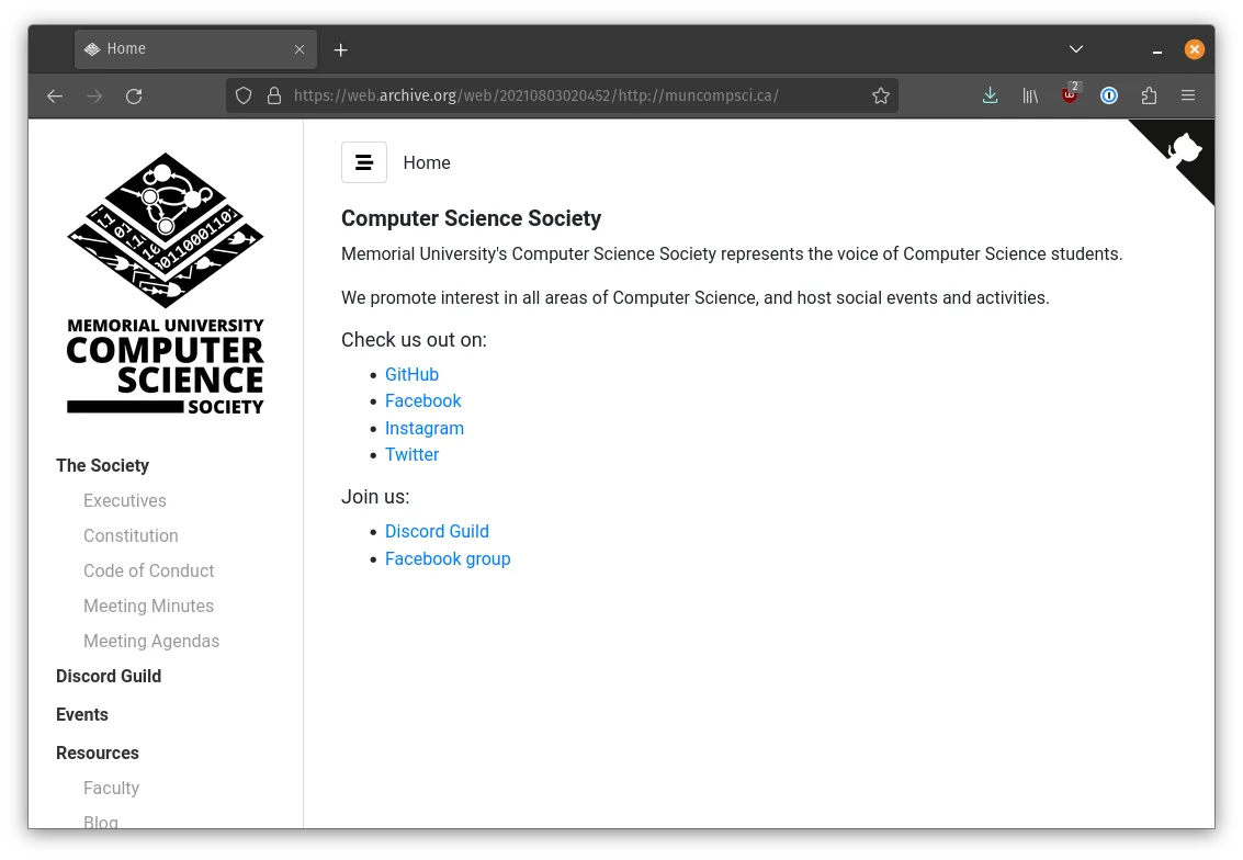
i didn’t jump into using it right away, but by the time astro 0.19.0 hit, i gave it a go for another shot at rewriting the muncompsci.ca site
it did not take me very long!, the slowest part was just figuring out a rejig of the content / look & feel of the site, i.e. the bit i wanted to focus on in the first place
the first version looked like this:
you can find the initial commit of the astro version here
its cool looking at files like index.astro in the old version,
alongside the new version; the overall structure remains similar to this day
i remember how happy i was for a framework to get out of the way, and simply let me get things done, especially in comparison to my previous attempt to use gatsby for the same website
to give an example of a page that’s very simple, lets look at this event page:
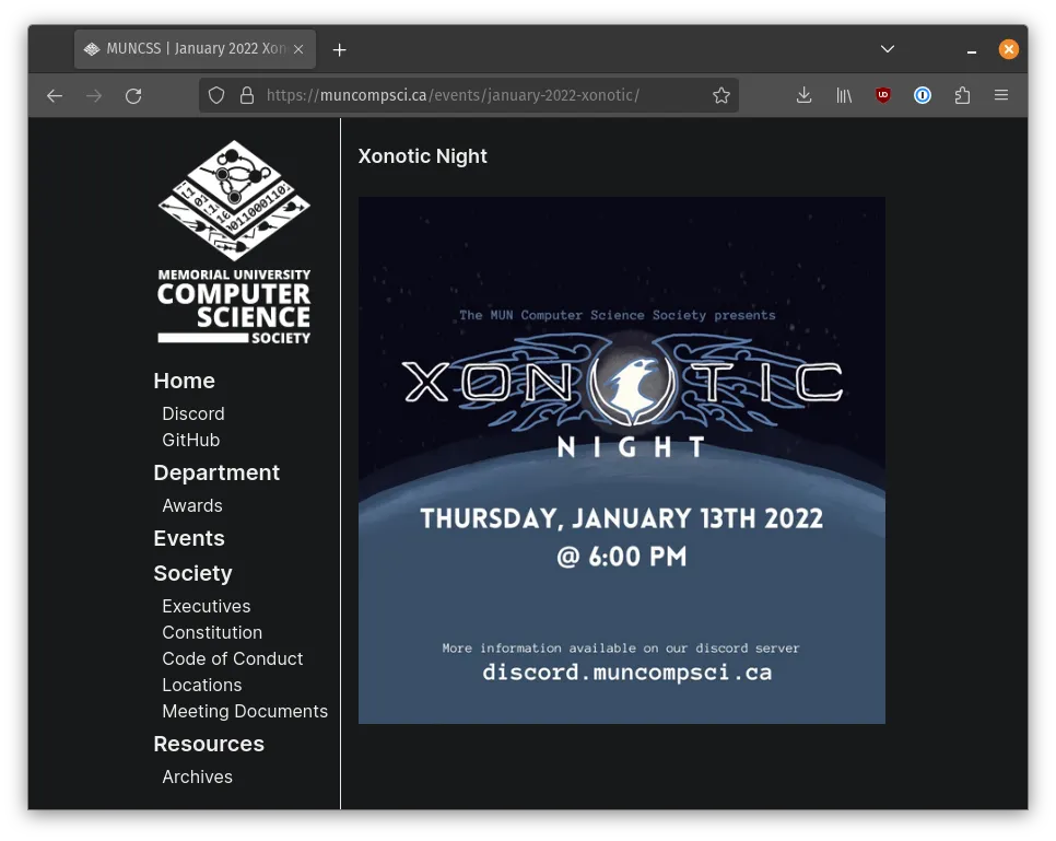
the markdown that powers this page is as follows:
---
layout: ../../layouts/Markdown.astro
title: January 2022 Xonotic Night
---
# Xonotic Night
<br />
the header on the page and the image are simply as you’d expect from a markdown file, markdown, cool!
but, obviously there is some magic happening with layouts/Markdown.astro in the frontmatter, but thankfully even that magic is… simple:
---
import Main from "./Main.astro";
const { content } = Astro.props;
---

<Main title={content.title}>
	<div class="markdown">
		<slot />
	</div>
</Main>
in Markdown.astro, we pluck out the content from the markdown file so we can give the page a title, and use the <slot /> element to denote where the rendered markdown content should end up
but then the magic must live in Main.astro! where’s all the busy logic?
---
import LeftSidebar from "../components/LeftSidebar.astro";
import "../styles/base.css";
const { title } = Astro.props;
---

<html lang="en" class="h-full">
	<head>
		<meta charset="UTF-8" />
		<meta name="viewport" content="width=device-width" />
		<title>MUNCSS | {title}</title>
		<link rel="icon" type="image/x-icon" href="/favicon.ico" />
	</head>
	<body class="h-full dark:bg-background-dark">
		<main
			class="h-full w-11/12 md:w-3/4 xl:w-7/12 2xl:w-1/2 m-auto flex flex-col md:flex-row"
		>
			<LeftSidebar />
			<div
				class="py-5 px-4 w-full md:w-9/12 h-full overflow-y-visible md:overflow-y-auto"
			>
				<slot />
			</div>
		</main>
	</body>
</html>
here in Main.astro is just the shared layout all the pages use, its mostly just a blob of html styled by tailwind, with a little bit of what looks like jsx/react with a LeftSidebar.astro component imported here so all the content isn’t stuffed into one file
this is, nice
astro gives you simple composition tools with simple components that can take in optional properties, but with something that feels like writing plain vanilla html much more than it does a using bespoke javascript framework / custom dsl / etc.
however when you do want to get your hands dirty with a super custom busy page, astro will still give you the tools required to do so, and for the most part, get out of the way
unlike with lektor which required opting out of the default functionality and writing your own integration sort of for non trivial features, with astro, if i want complete custom control over a single page, i just write in a .astro file for that page with what i need for it
be that the list of executives, or the listing page for all the events
astro makes adding these sorts of pages easy, often times with minimal levels of bespoke code required, or encouraging you to break logic into into reusable components
and thankfully, as expected, contributions from others who have never used astro came in after i merged the refactor, and everyone has seemed to have a good time!
jackharrhy.com
so, back to my personal website
i enjoyed using astro for muncompsci.ca, so i knew eventually i’d convert my personal site to use it as well
in april of 2022, i did just that
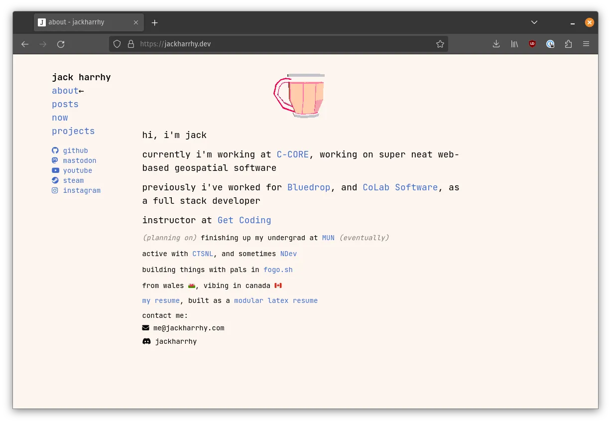
while this is my most ‘prominent’ astro website, it’s the one i have the least to talk about, since it has the fewest amount of features and pages than any other astro site of mine
the homepage is nice and basic, the only interesting thing on it is probably the mug component, which uses the picocad-web-viewer initialized using a handy astro <script> tag within a .astro component to spin a 3d model of a tea cup i created using picoCAD
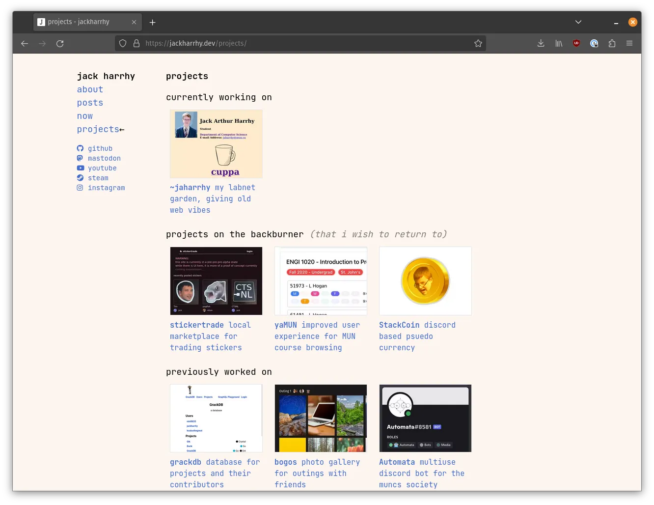
it has a projects page, that has ‘projects’ defined like so:
<Project
  title="~jaharrhy"
  link="https://www.cs.mun.ca/~jaharrhy/"
  description="my labnet garden, giving old web vibes"
/>
in which Projects.astro is simply:
---
const { title, link, description } = Astro.props;
---

<a href={link} target="_blank">
	<div class="w-[10.5em]">
		<img
			src={`/images/projects/${title}.webp`.toLowerCase()}
			class="w-[10.5em] h-[7.75em] object-cover border"
		/>
		<h3 class="mt-2 text-[0.85em]">
			<span class="font-semibold">{title}</span>
			{description}
		</h3>
	</div>
</a>
nice
all i can really say here, is that it’s nice
not making use of many special features because its a pretty simple personal site as the moment
www.cs.mun.ca/~jaharrhy/
around july of 2022, i also switched over my mun page to astro, the site that i currently have this blog post hosted on!
previous to using astro, my intent was to keep things as similar as possible to the ‘old web’ / as a callback to geocities era
the most important thing was making sure the look and feel felt correct, but i also thought it’d be interesting
to avoid using any sort of build tool, and just ‘hand roll’ the html/css/js (by ssh-ing into garfield and cracking open vim)
this was fine when the site was new, but i kept layering on features and buttons and subpages, therefore the html after a while become similar to Fordite, i.e. busy, large, no reuse
the biggest issue was that it felt hard to add new features to that version of the site
picking astro did feel like i was going back on one of my goals of not using a build system, but after i was done i was able to focus a lot more on the content and feel than worrying about code structure, so the version that stands today is a thankfully improved version of what stood before, let’s dig into it a bit:
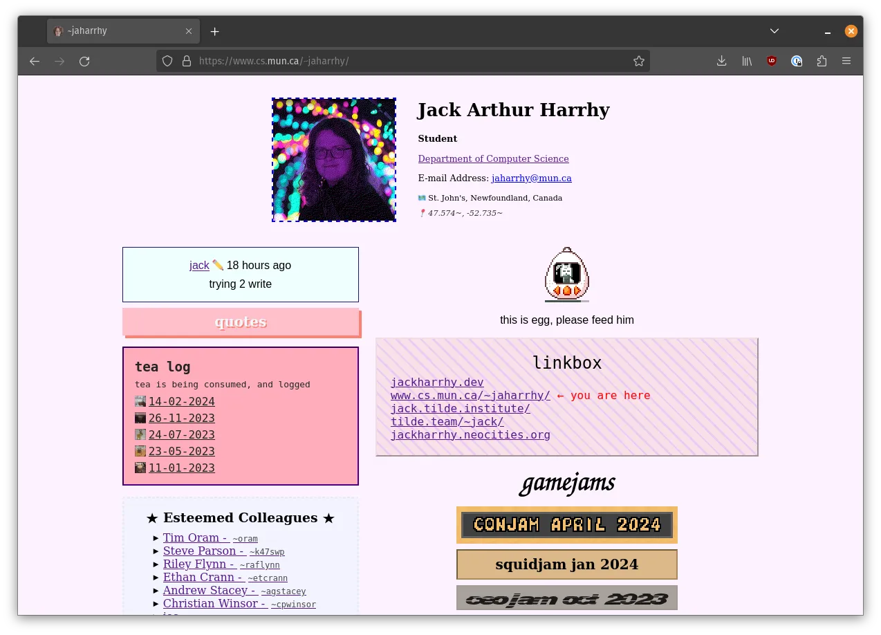
this is the homepage, where most of my effort has been spent on since i created the site in 2019
each div on this page has its own thing going on, and that is very much intentional
the colors, while not as striking as the average geocities beautiful eyesore, are still a lot more complex than the simple ‘safe’ color palette most websites tend to lean towards these days
most of the pages on this site are a bit too busy to chronicle with just one code block, but if you check out the source for the root / index page here, you’ll see that i’m importing a considerable amount of components
even though there is a lot of css and code required for this page, it would be much more complex if i was still limiting myself to just plain html, astro lets me compose components together with ease
(and no, i know you could probably go crazy with html <template> element and some custom javascript, but that did not feel like
something i wanted to spend any time considering)
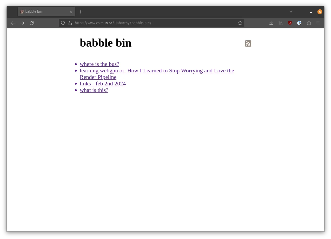
can’t not mention the babble bin, on the babble bin
i am using two fantastic pieces of astro here, content collections,
and @astrojs/rss
the content collections can read from a directory of files, such as .mdx files,
and given a simple schema,
give you type-safe utility functions for iterating through said collections,
alongside methods to render that content easily into into a .astro page
all of the above sounds like a lot, especially if you are coming from the world of gatsby, but astro makes this sort of thing quite a lot easier
@astrojs/rss, is used to power the babble bin’s rss feed, this i can include in this blog post due to its tiny size!
import rss from "@astrojs/rss";
import { getCollection } from "astro:content";

export async function GET(context) {
  const babbles = (await getCollection("babble-bin")).filter(
    (entry) => entry.data.pubDate !== null
  );
  return rss({
    title: "babble bin",
    description: "a bin full of babbles",
    site: context.site,
    items: babbles.map((post) => ({
      title: post.data.title,
      pubDate: post.data.pubDate,
      description: "",
      link: `./babble-bin/${post.slug}/`,
    })),
    customData: `<language>en-us</language>`,
  });
}
nice and simple, this also makes use of the collections feature, basically just reshaping the data to a structure the rss
function accepts, which will spit out a compliant rss feed
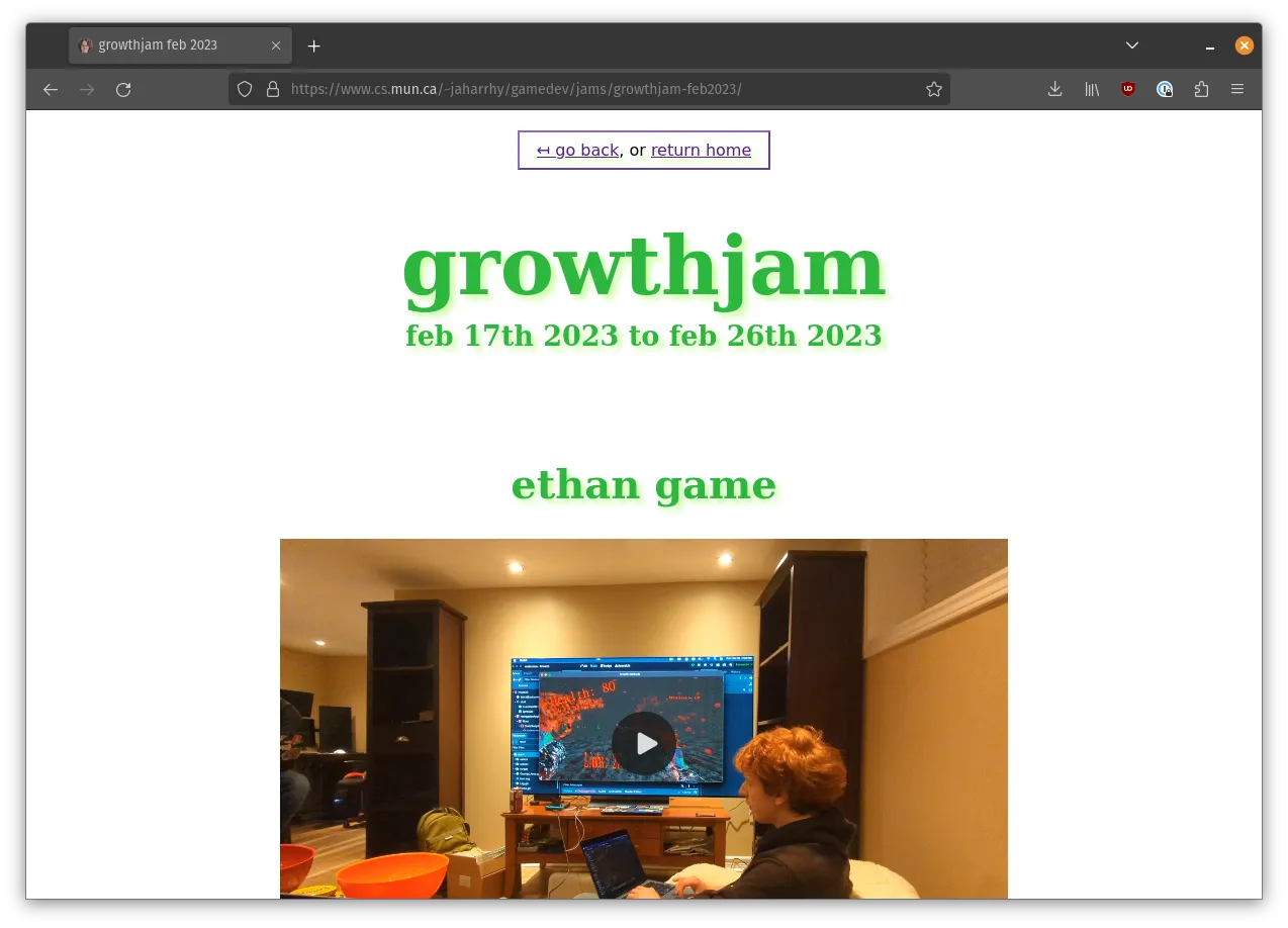
the structure of my mun site is great, as in it almost completely lacks any sort of structure in some ways, and is instead welcoming to any content that wishes to call it home
one such piece of recurring content is game jam entries, above being the entry for growthjam
you’ll find pages like these strewn across my mun site, with nice and tidy .astro files implementing them with whatever look and feel felt right for each individual page
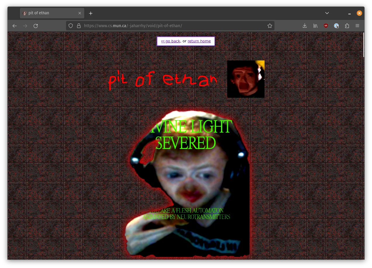
can’t not mention the pit of ethan while i’m at it
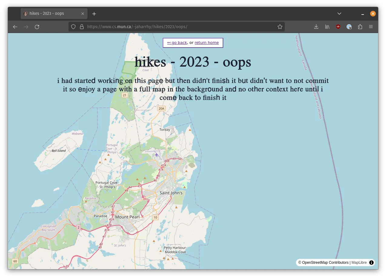
and lastly, one of my only uses of an interesting feature of astro: a page using SolidJS
astro lets you mix and match different frameworks of your choosing, even on the same page, with ‘islands’
for this page, i wanted to use MapLibre, and they actually had an example of using maplibre with solid, and since solid is a library without a virtual dom that still feels like react from a syntax perspective, it made sense to reach for it for interfacing with a framework agnostic javascript library
there’s no actual content here though, i got the basemap working as a full page background, and shipped it ⛴️
jackharrhy.neocities.org
then, after all the others, in december of 2022, i moved my neocities page over to astro
(it was hardly a website beforehand however, i think sometime in 2020 i threw a simple ‘hello world’ onto the page and forgot about it, so maybe i can consider this my only current astro greenfield website!)
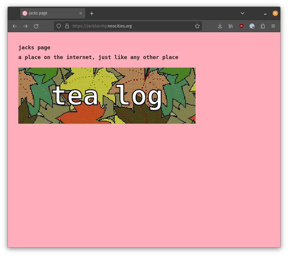
the tealog is the meat of my neocities website, maybe someday there will be more, but for now, tea
again, we have heavy usage of content collections from astro to take a directory of .mdx files, this time with
a rating system in the tags
the thing i’m the most happy about on this site isn’t actually astro, but instead the fish script i wrote to take the high definition versions of the tea images, and turn them into bordered and dithered thumbnails for use on its own listing page, and the rss feed
similar to my mun page i wanted to make this no build plain html/css site, but yet again since i wanted to write textual content, i was a much bigger fan of having the usual write markdown and use a build tool approach for this site as well
honorable mentions
there are some other folks i know who have used astro for their respective sites:
- riley’s current personal site, repo here
- liam’s current personal site, repo here
- mitch’s mun site, repo here
- keenan’s current personal site, repo here
- josh’s current personal site, repo here
- devin’s current personal site, repo here
- ethan’s current personal site, repo here
- evan’s current personal site, repo here
- gavin’s personal website, currently
CONNECTION_REFUSEDat the time of me writing this blog post so i can’t archive it!, if you’re reading this gavin, fix it and poke me so i can update my post 😊
some of these look like they were greenfield astro websites from scratch, while others are using templates, all of them of course are great!
i like astro
i enjoy astro, i hope to be using it into the future, and that it continues to receive great updates over the years
maybe one day i will consider using it for more than just static websites and use one of its newer features that permits for server side rendering, therefore turning astro into something more akin to a next or remix
but it’s a static website powerhouse i will continue to shill
any thoughts about any of the above?
reach out: